Back

Read all

Coding Sphere Logo

Improvised Coding Sphere UX, UI, IA & Conversion Focused for a Digital Agency.

Improvised Coding Sphere UX, UI, IA & Conversion Focused for a Digital Agency.

Improvised Coding Sphere UX, UI, IA & Conversion Focused for a Digital Agency.

Bringing structure, intention, and performance to Coding Sphere’s digital identity.

Figma

Figma

Figma


Coding sphere website mockup


— Role & Responsibility

I led the redesign across IA, UX, UI, and visual systems—elevating clarity, trust, and conversion for the agency’s digital presence.


01 — Overview

Coding Sphere is a tech & creative agency offering web development, branding, and product services. Their existing website didn’t reflect their capability, credibility, or scale. It felt template-driven, lacked structure, and failed to communicate value to potential clients.

The redesign objective was clear:

Position Coding Sphere as a high-trust, high-clarity, modern agency and turn their website into an acquisition engine.


02 — Problem Space

Ran a heuristic audit of the old platform, to break-down the problem spaces.


1. Unclear Positioning

  • Vague messaging; users couldn’t identify what the agency truly offers.

  • No differentiation from competitors.


2. Weak Information Architecture (IA)

  • Product, service, and portfolio pages were either missing or scattered.

  • Non-linear navigation created unnecessary friction.


3. Low Conversion Pathways

  • No lead funnels, service explanation, or structured CTAs (Call to Actions).

  • Users couldn’t find the next step to contact or trust the agency.


4. Outdated Visual Language

  • No cohesive style guide.

  • Inconsistent typography, spacing, and color usage.

  • More like a WordPress template rather than a professional agency.


5. Zero Social Proof

  • No case studies, testimonials, or credibility markers.


new vs old design

Ref. Image: New Vs Old Design


03 — Project Goals

Business Goals

  • Increase qualified leads.

  • Strengthen brand trust and positioning.

  • Communicate expertise through strong UX, copy, and visuals.


User Goals

  • Understand what Coding Sphere does within 5 seconds.

  • Explore services effortlessly.

  • Feel assured through testimonials, case studies, and proof points.

  • Convert quickly via clear pathways.

zoom section from the design

Ref. image: Zoomed sections from the design


04 — Discovery & Insights

User Insight 01 — People don’t buy services; they buy trust

Clients visiting agency websites scan for:

  • Portfolio

  • Testimonials

  • Clear scope/process

  • Pricing indicators

  • Expertise tags


User Insight 02 — Agency clients want speed & clarity

Through benchmarking, we found top-performing agencies follow:

  • Single value proposition

  • Crisp 2–3 line description

  • Modular sections

  • Strong visual identity


User Insight 03 — Language = conversion

UX writing needed to shift from generic to:

  • Value-driven

  • Outcome-focused

  • Industry-aware

A dribble sort of mockup design

Ref. Image: A dribble short mockup here


Coding sphere website mockup


01 — Overview

Coding Sphere is a tech & creative agency offering web development, branding, and product services. Their existing website didn’t reflect their capability, credibility, or scale. It felt template-driven, lacked structure, and failed to communicate value to potential clients.

The redesign objective was clear:

Position Coding Sphere as a high-trust, high-clarity, modern agency and turn their website into an acquisition engine.


02 — Problem Space

Ran a heuristic audit of the old platform, to break-down the problem spaces.


1. Unclear Positioning

  • Vague messaging; users couldn’t identify what the agency truly offers.

  • No differentiation from competitors.


2. Weak Information Architecture (IA)

  • Product, service, and portfolio pages were either missing or scattered.

  • Non-linear navigation created unnecessary friction.


3. Low Conversion Pathways

  • No lead funnels, service explanation, or structured CTAs (Call to Actions).

  • Users couldn’t find the next step to contact or trust the agency.


4. Outdated Visual Language

  • No cohesive style guide.

  • Inconsistent typography, spacing, and color usage.

  • More like a WordPress template rather than a professional agency.


5. Zero Social Proof

  • No case studies, testimonials, or credibility markers.


new vs old design

Ref. Image: New Vs Old Design


05 — Strategy

I built the redesign around three pillars:

1. Clarity : One hero line + subtext + 2 primary CTAs.

Clear service breakdown using modular cards and icons.

2. Trust : Case studies, testimonials, metrics, clients, and process—placed early and repeated throughout the scroll.

3. Conversion : CTA repetition, sticky contact strip, “project inquiry” button, and lead form optimization.


07 — Visual & System Design

Design System

  • Typography: Raleway + Inter pairings

  • Colour System: Dark mode default with #5955FB accents

  • Spacing System: Consistent 8px baseline grid

  • Components:

    • Cards

    • CTAs

    • Filters

    • Bento grids

    • Accordion (for FAQs)

    • CTA banners

Motion

Soft, subtle micro-animations to bring life without overwhelming.

Accessibility

  • Contrast-checked colours

  • Button labels for conversion-led ux

  • Keyboard-friendly focus states


A pricing section using bento grid method on uding hover it expands

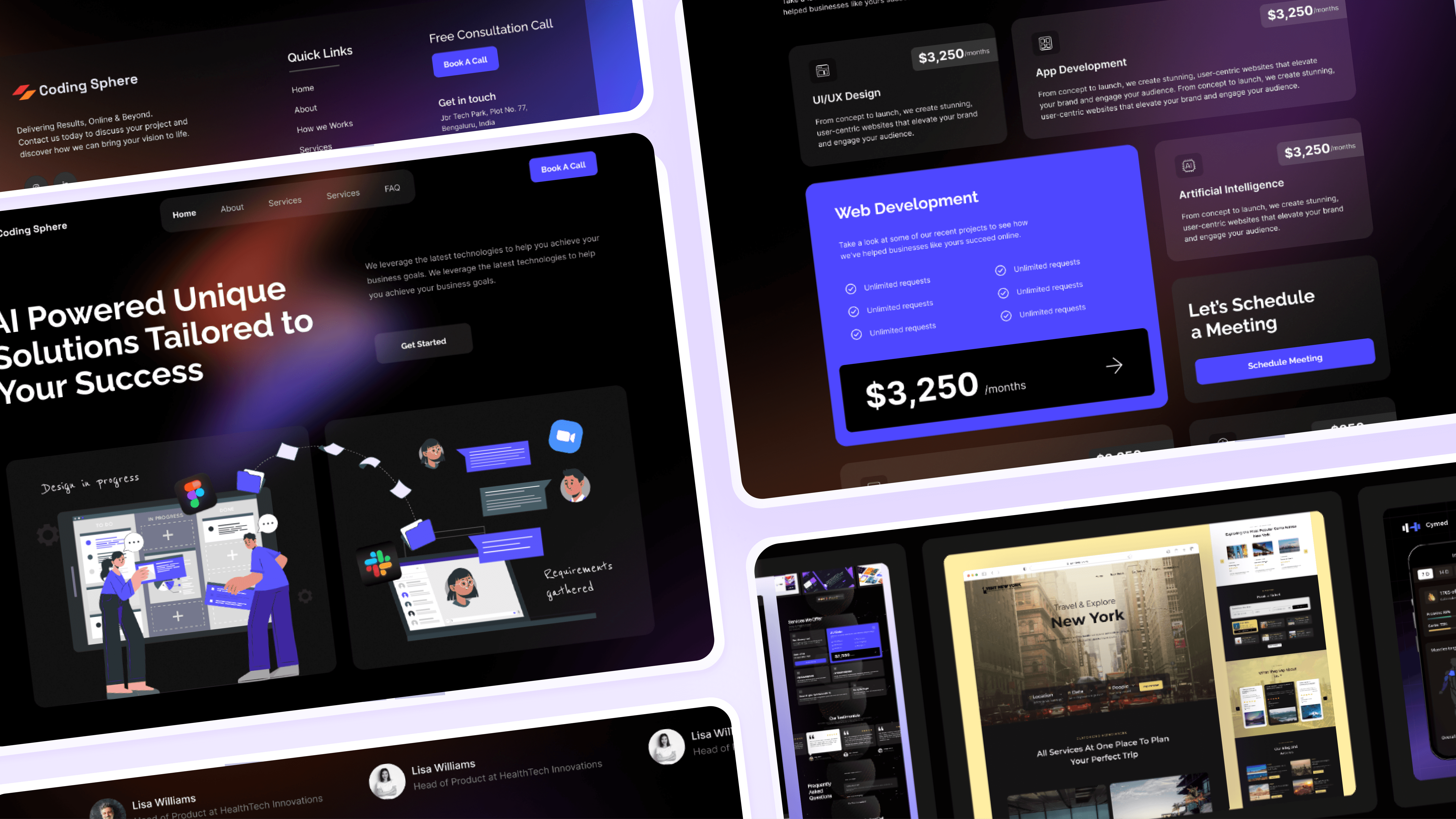
Ref. Image : Pricing layout using bento grid that expands with each hover state.


06 — Final Experience

Hero Section

“We build digital experiences that help brands grow.”

Supporting line: outcome-focused, not task-focused.

Two CTAs: Book a Free Consultation and Start a Project.

Followed by the other sections of the website.

a show reel using the design

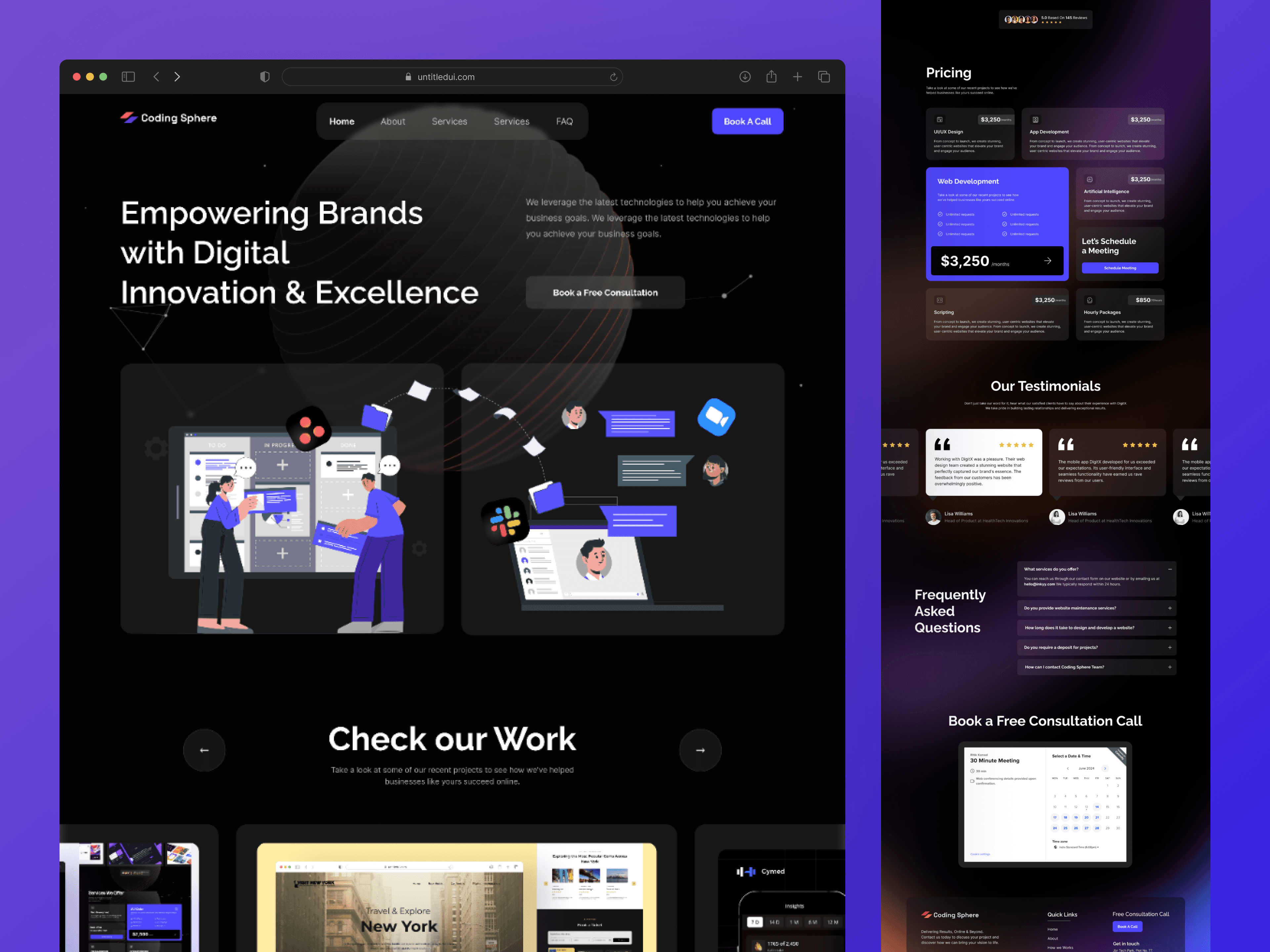
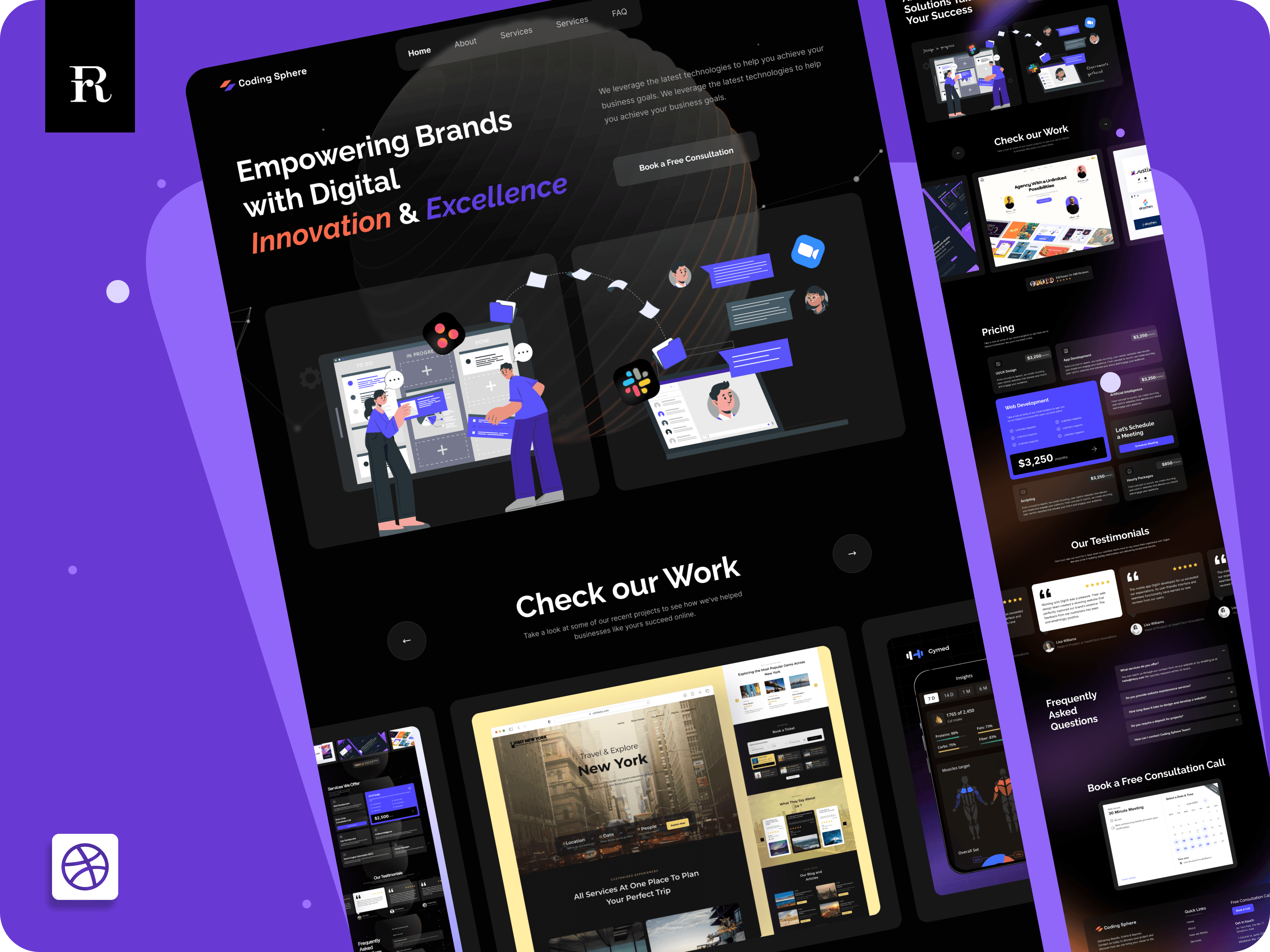
Ref. Image : A mockup showreel of the design

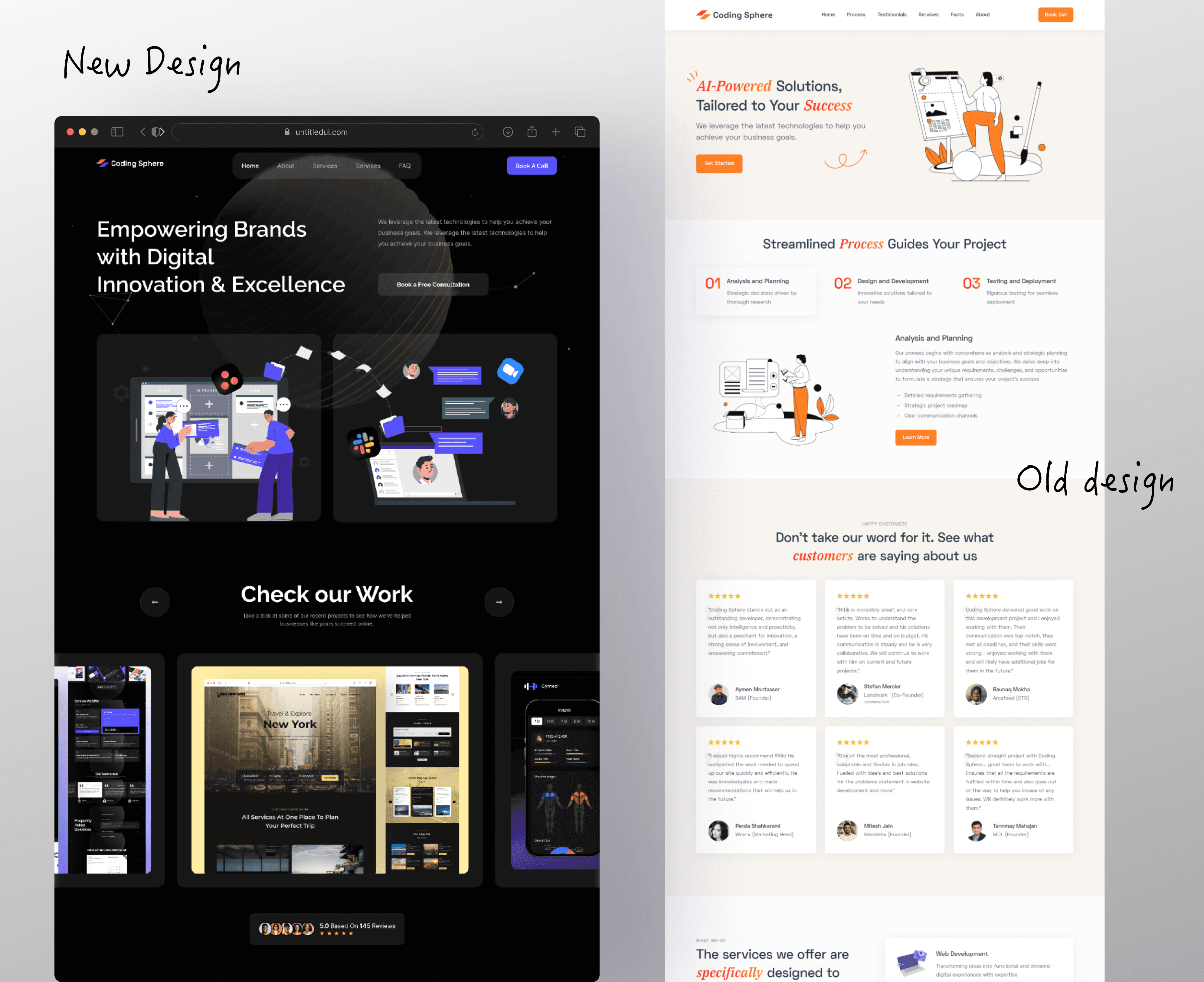
After — Redesigned Website

The redesign introduces a modern, high-contrast, credibility-first visual identity aligned with agency expectations.

The new experience focuses on clarity, trust, and conversion pathways.

Key improvements:

  • Bold dark theme with strong contrast & sharper hierarchy

  • Modern illustrations aligned with tech/agency storytelling

  • Clear messaging and structured sections

  • High-trust components: featured work, metrics, founder block, pricing

  • Modular card components & scalable design system

  • Polished, premium visual language representing a serious agency

  • Stronger CTA placement (primary button, booking flow, lead funnel)

  • Testimonials, FAQ & consultation call structured for conversion

  • Overall experience feels premium, intentional, and high-confidence

The redesigned version transforms Coding Sphere from a generic service provider into a modern, credible, and conversion-focused digital agency.


08 — Impact

41% increase in time on site

2.8× more portfolio interactions

Higher lead quality from pre-qualified inquiries

Better brand perception across social channels

The redesign didn’t just make Coding Sphere look better; it transformed their digital presence into a growth engine.


09 — What I Learned

  • Agency websites need simplicity, modularity, and credibility more than visual fireworks.

  • UX writing dramatically influences perception.

  • A strong IA can double the clarity of an agency’s brand story.

  • Continuous iteration leads to a sharper, cleaner product.


Next work

Next work

Next work

Explore more
works.

View all

View all

Landmark - case study thumbnail
Coach LMS - case study thumbnail
Book@Play - case study thumbnail

Create a free website with Framer, the website builder loved by startups, designers and agencies.