Back
Read all

Transforming institutional learning through thoughtful design, measurable impact, and scalable execution.
Figma, Notion
Constraints
To balance the varied requirements while ensuring a unified, scalable design across web and mobile platforms. Navigating complex educational workflows while maintaining simplicity and accessibility.
Technology Integration
Security and Privacy
User Adoption and Engagement
Compliance and Reporting
Continuous Improvement and Innovation
Scalability and Performance
Customization and Flexibility
Training and Support
Content Management and Updates
Cost Management
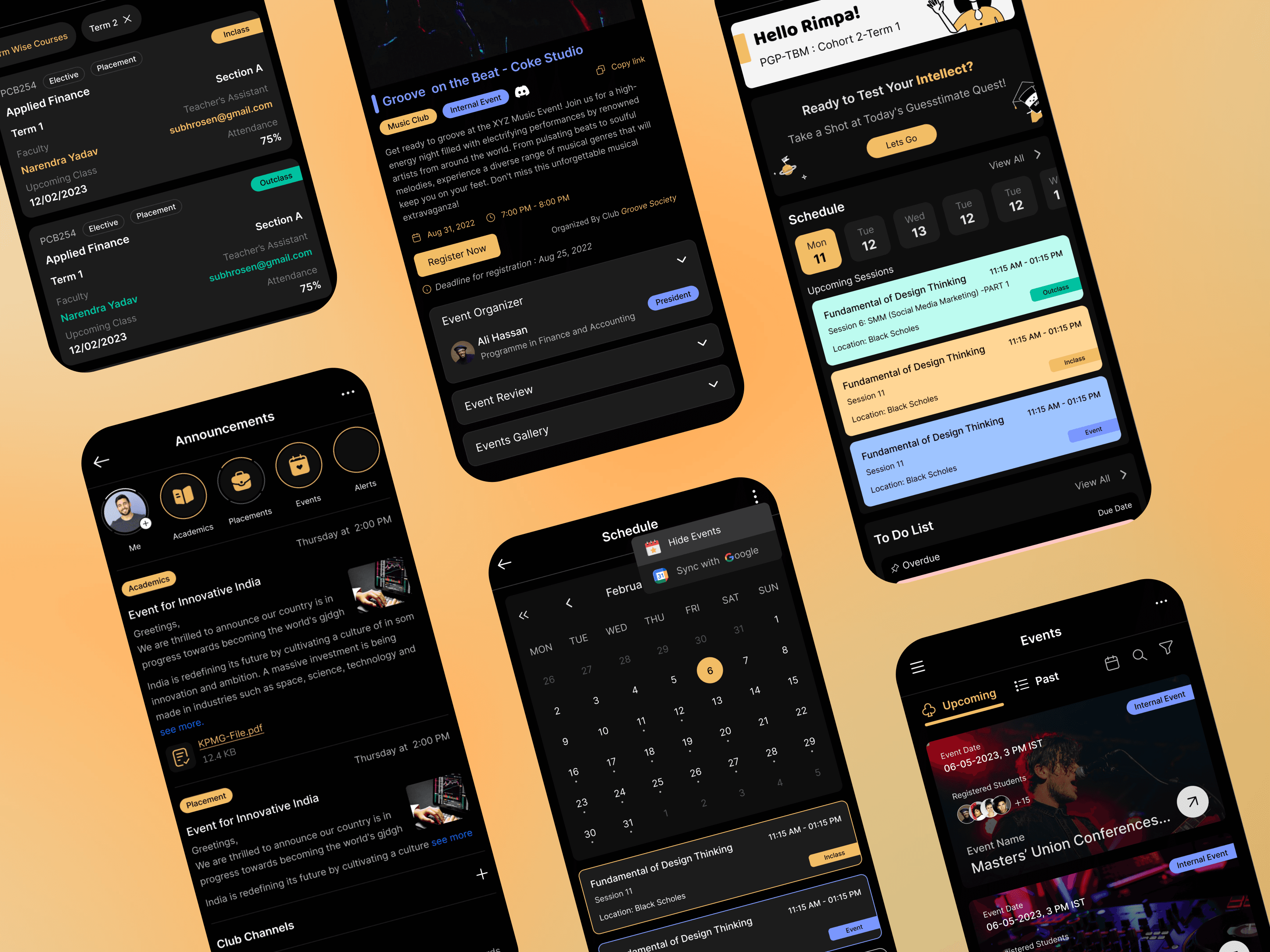
Ref. image : Few more glimpse of the 1st mobile responsive app screens, which is later updated with new style guide.
Trade-offs
1. Prioritizing speed over feature depth in v0.1
To deliver the platform before the academic cycle, we prioritized core functionality and clarity over advanced capabilities. This allowed us to launch quickly, gather real usage data, and iterate based on real needs rather than assumptions.
2. Balancing customization vs. consistency
Different teams asked for custom layouts, but we opted for a consistent design system to ensure scalability, reduce cognitive load, and simplify future maintenance.
3. Choosing simplicity over exhaustive control
Administrators initially requested complex controls, but we reduced configuration layers to avoid overwhelming them and to streamline everyday workflows.
4. Iterating with live constraints
Post-launch improvements were shaped by technical feasibility and academic schedules, requiring us to roll out updates in small, safe increments rather than sweeping redesigns.
5. Designing for multiple personas with shared features
Students, teachers, and admins had conflicting needs. We standardized shared patterns to reduce UI complexity while building specialized components only where impact was highest.
6. Cutting lower-impact ideas to maintain delivery velocity
Several “nice-to-have” features were deferred to ensure we hit deadlines for high-impact student and faculty workflows.
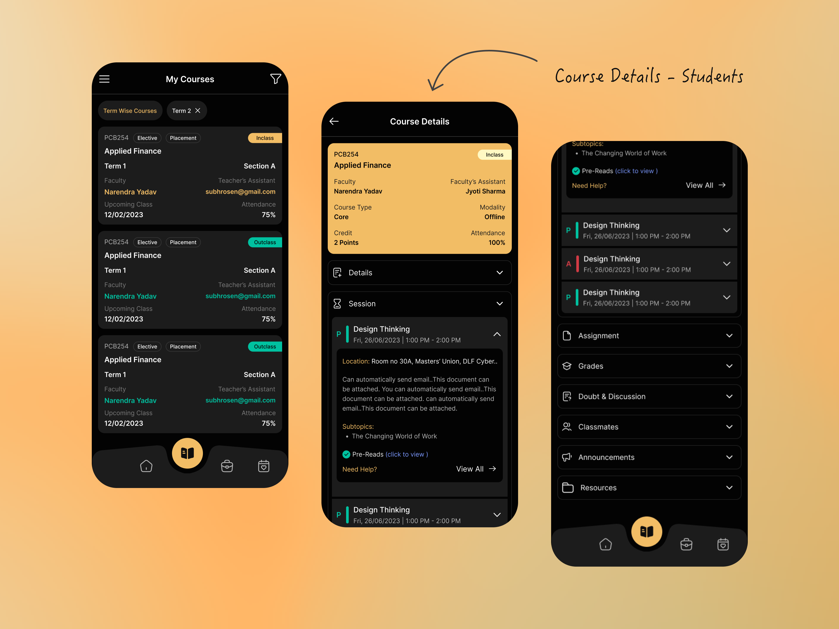
Ref. image: showing glimpse of course details mobile screen
Measurable Outcomes
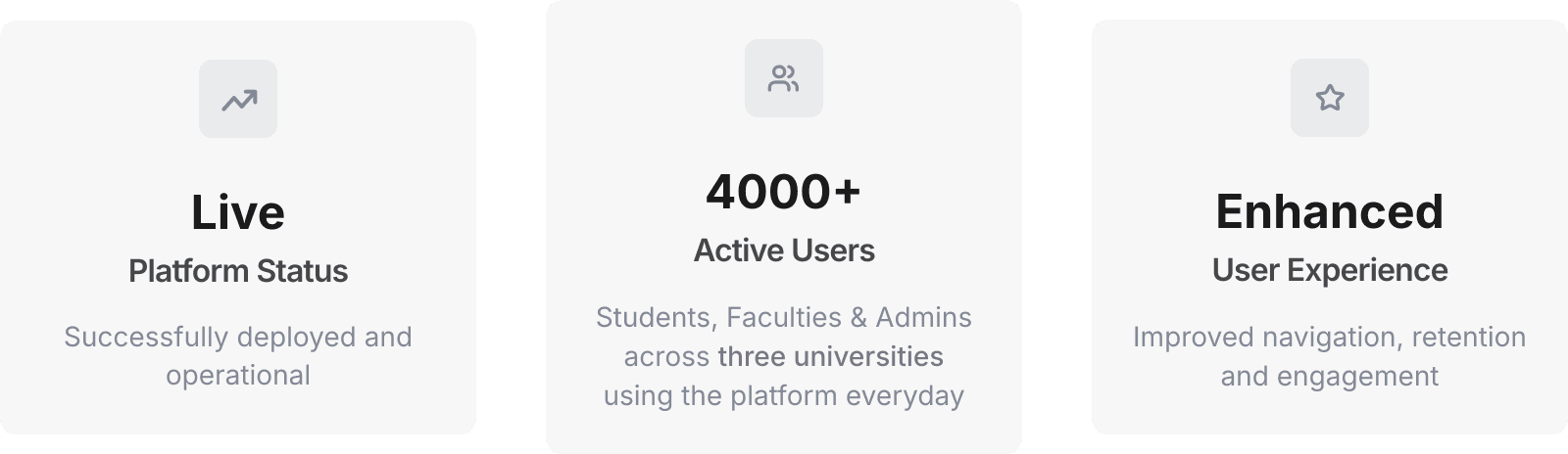
Currently a live platform serving thousands of users across three different universities with improved course navigation, retention, and content engagement.
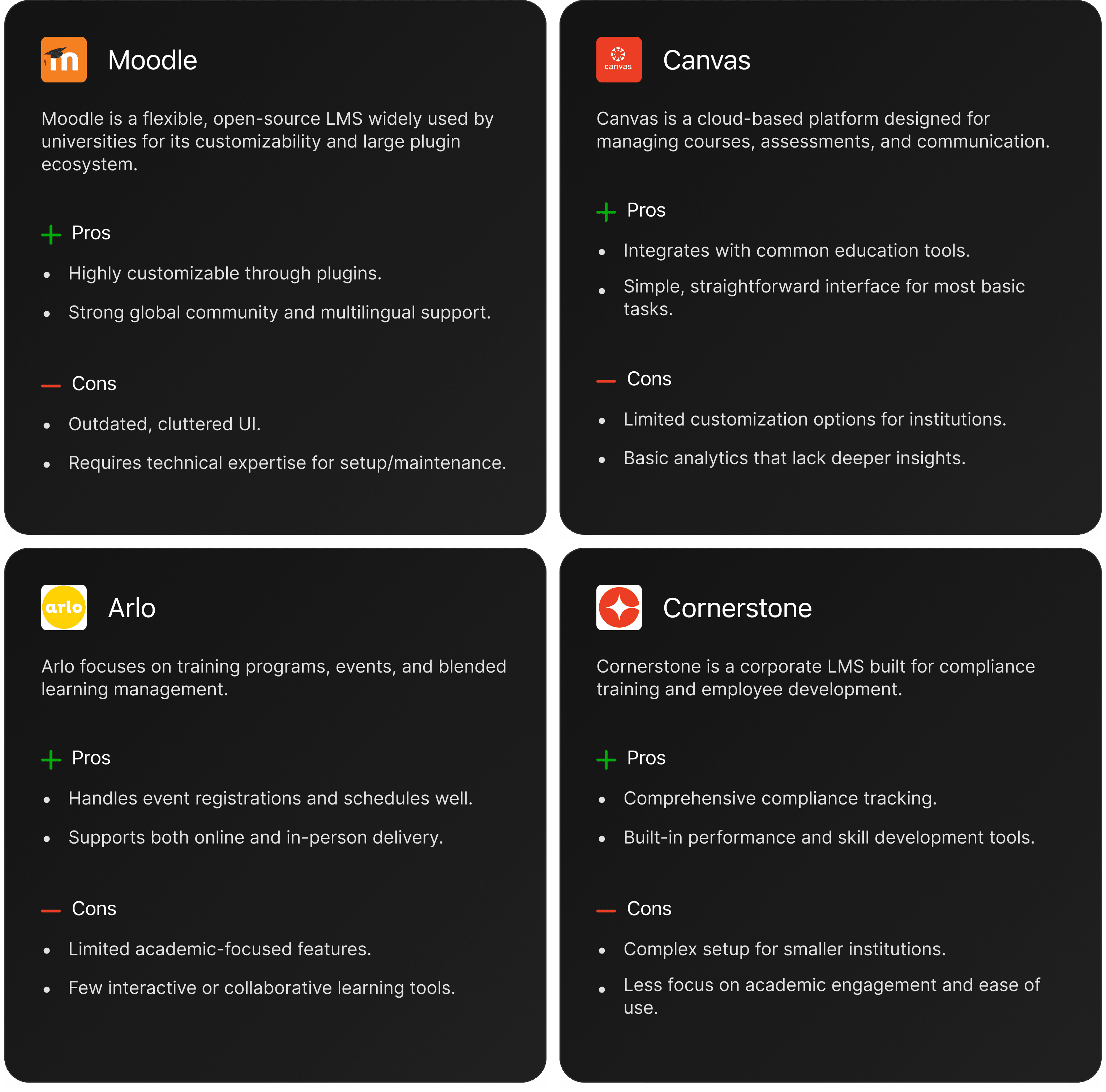
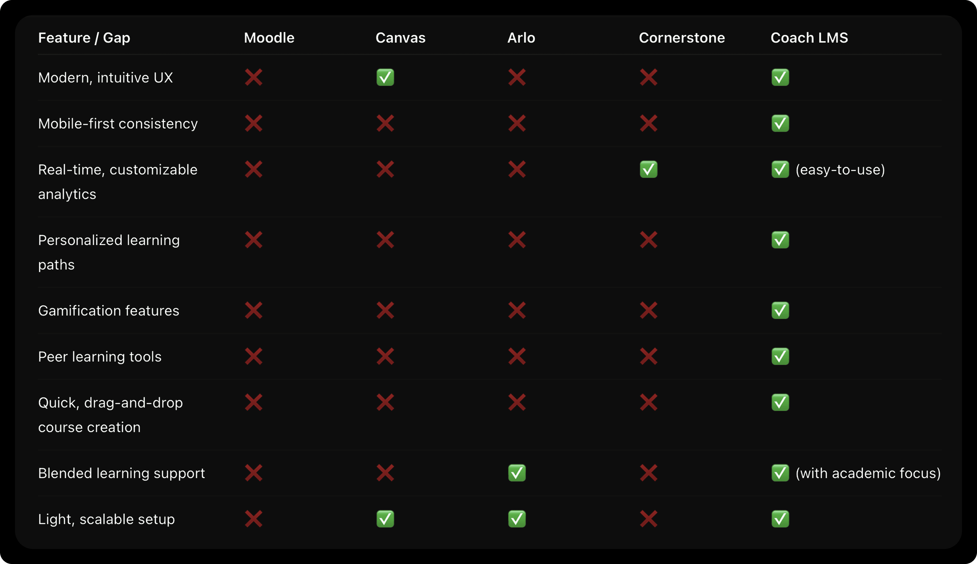
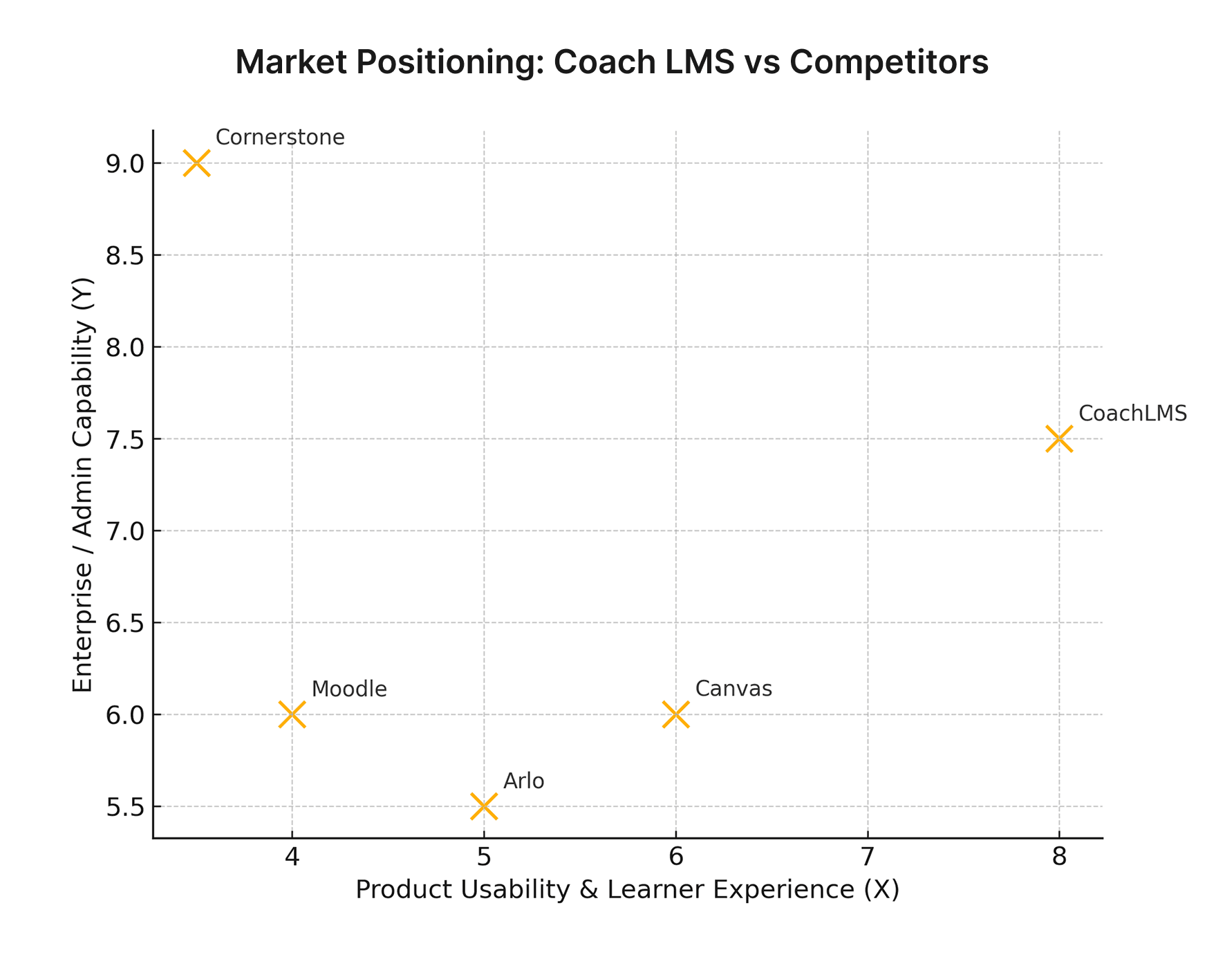
Competitor Analysis
By analyzing these competitors, we have identified the Pain points and opportunities in the LMS market. Our LMS will prioritize a user-friendly interface, intuitive navigation, and extensive customization options to meet diverse customer needs. Additionally, we will focus on advanced reporting and analytics features, seamless integrations, and emerging trends to provide a cutting-edge solution.
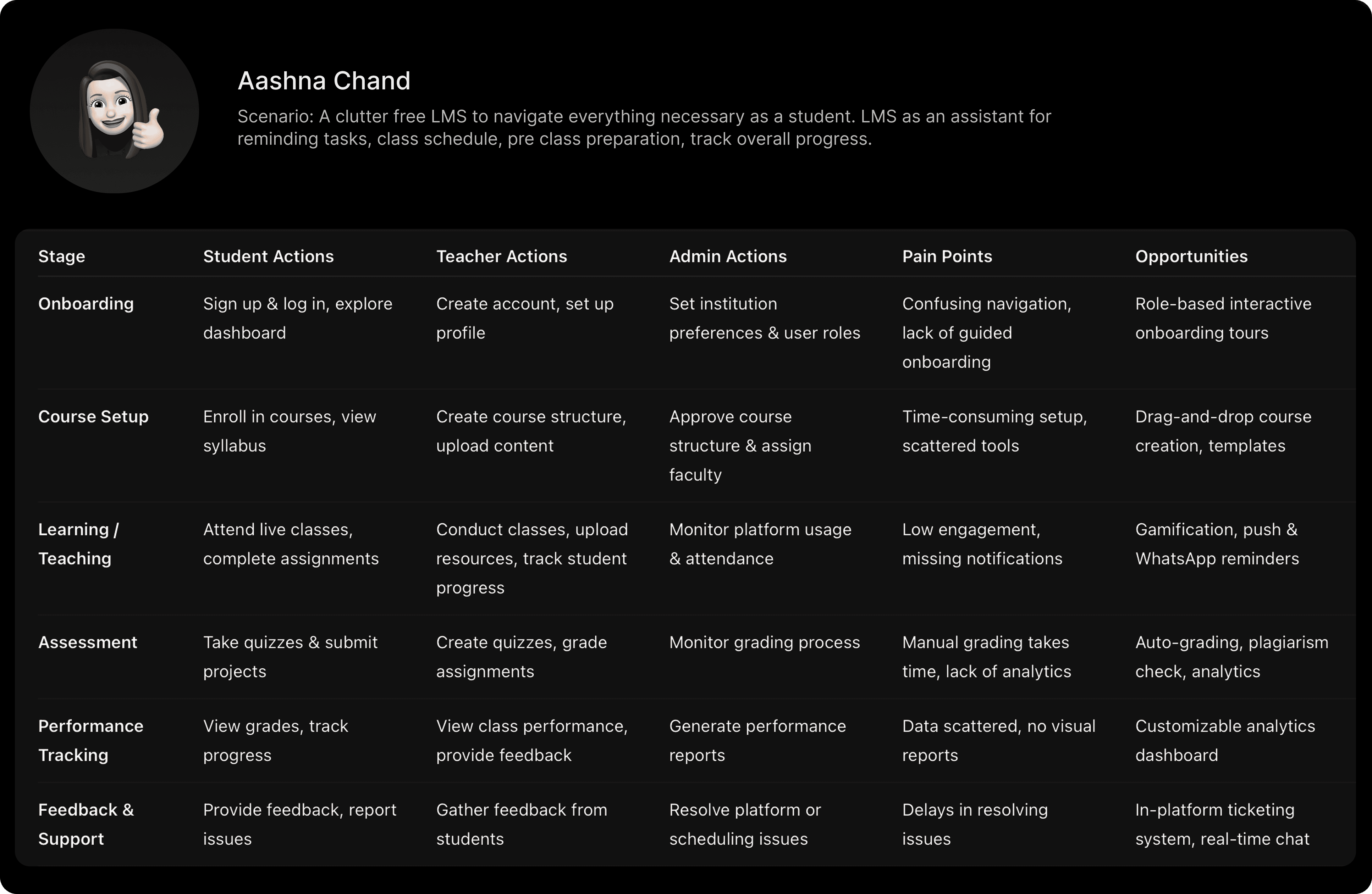
Analysis to understand the pros and cons of current LMS tools, focusing on how they facilitate user flows and management.
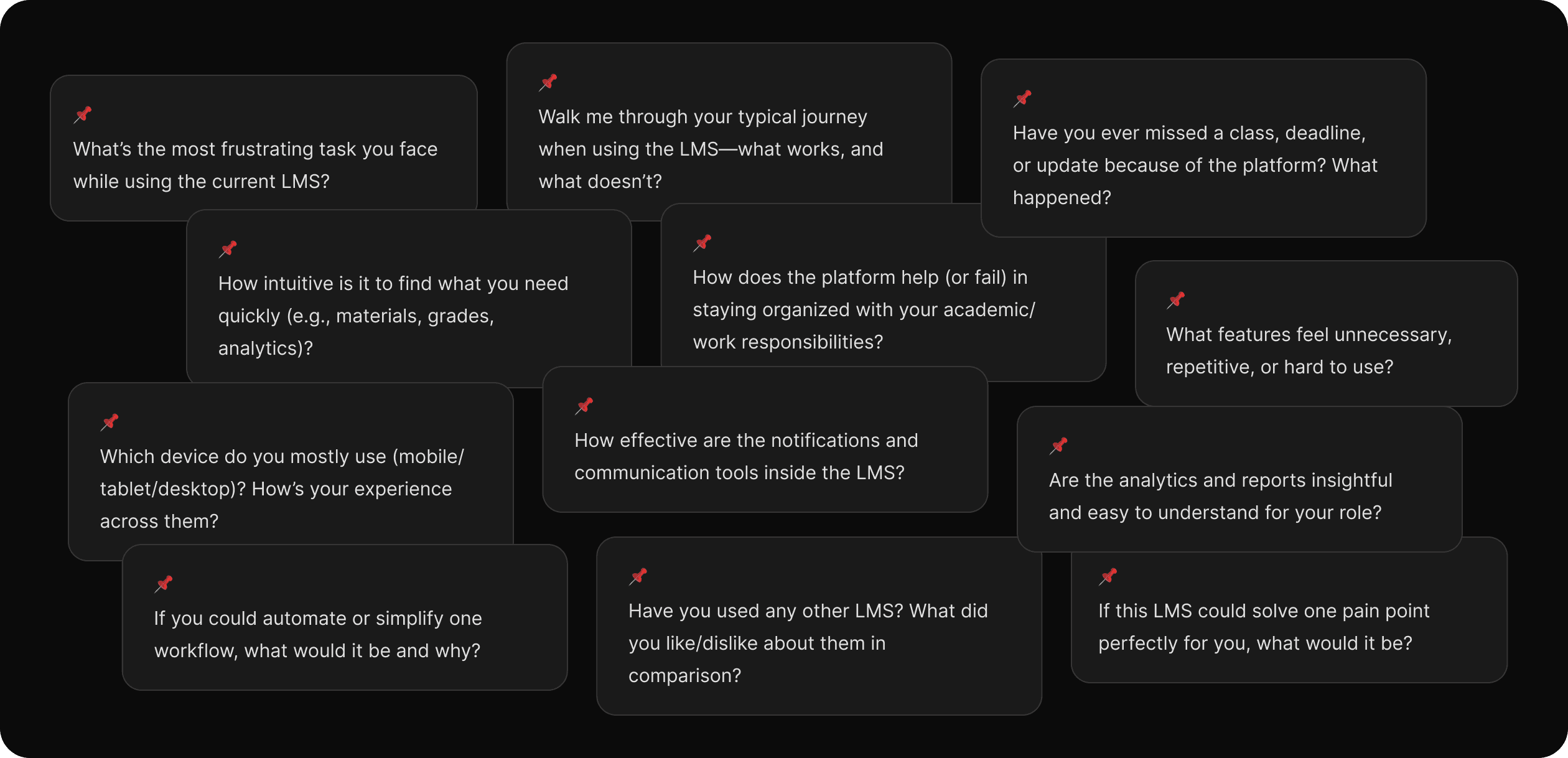
Research Summary
Primary user interviews & testing: our students, teachers, admins — validated needs around quick course setup, timely notifications, progress visibility, and admin reporting. (internal research + prototype)
Benchmarks / Competitors: reviewed Moodle, Canvas, Arlo, Cornerstone to identify feature and UX gaps.
Market Context: global LMS market is large and growing rapidly — credible market reports place the LMS market value between ~$22–27B (2023–2025) with projected CAGR ~17–19% depending on the source — this demonstrates strong TAM for a SaaS-ready LMS.
User Interviews
Conducted 50+ user interviews with students, teachers and admins to understand their pain points and workflows to validate features and prioritize experience improvements.
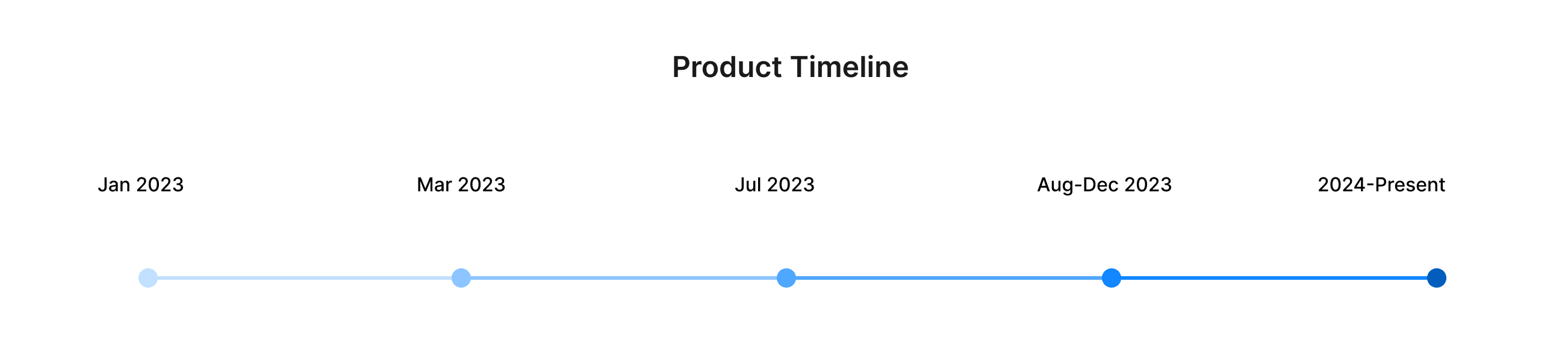
Project Timeline
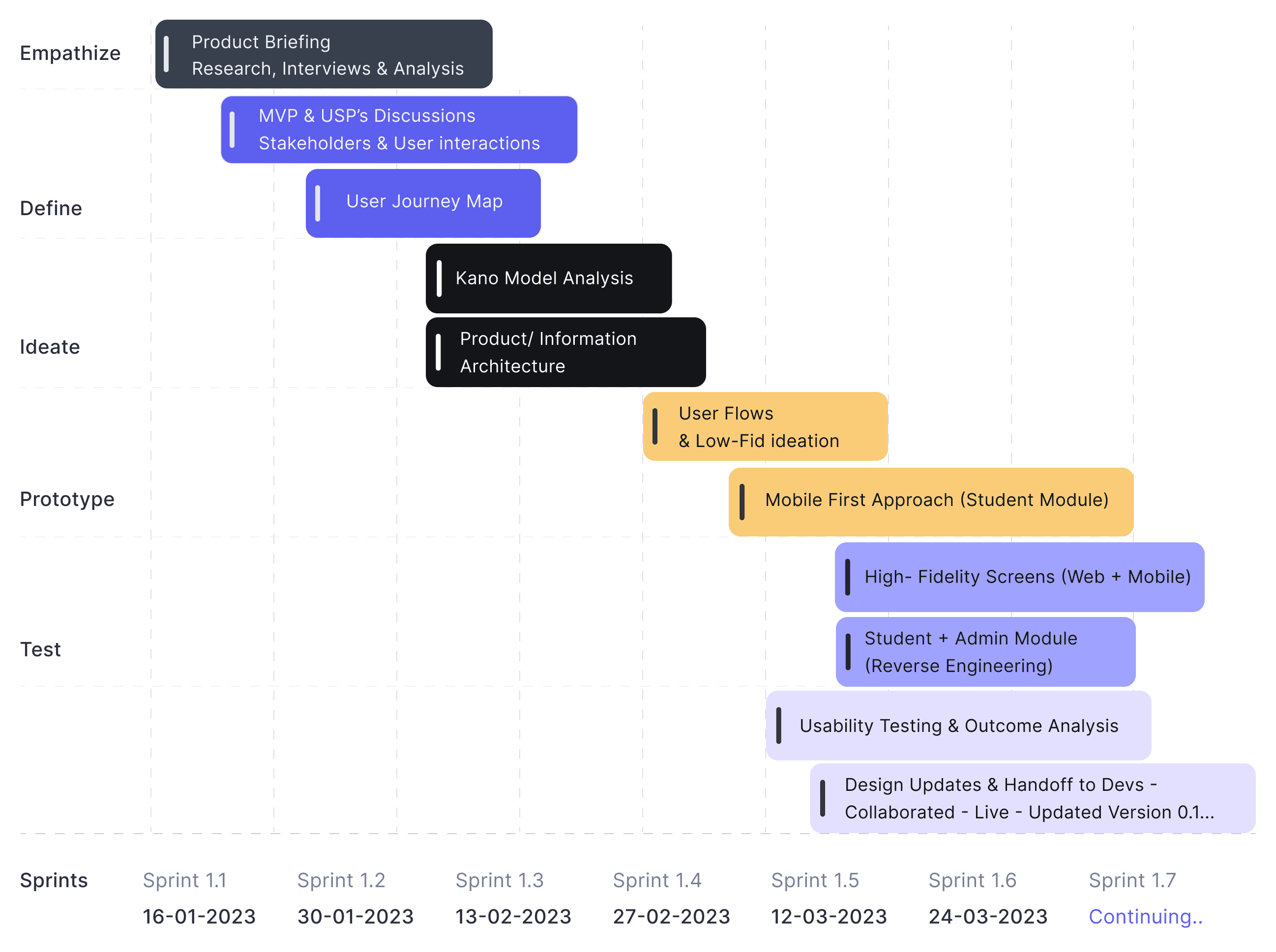
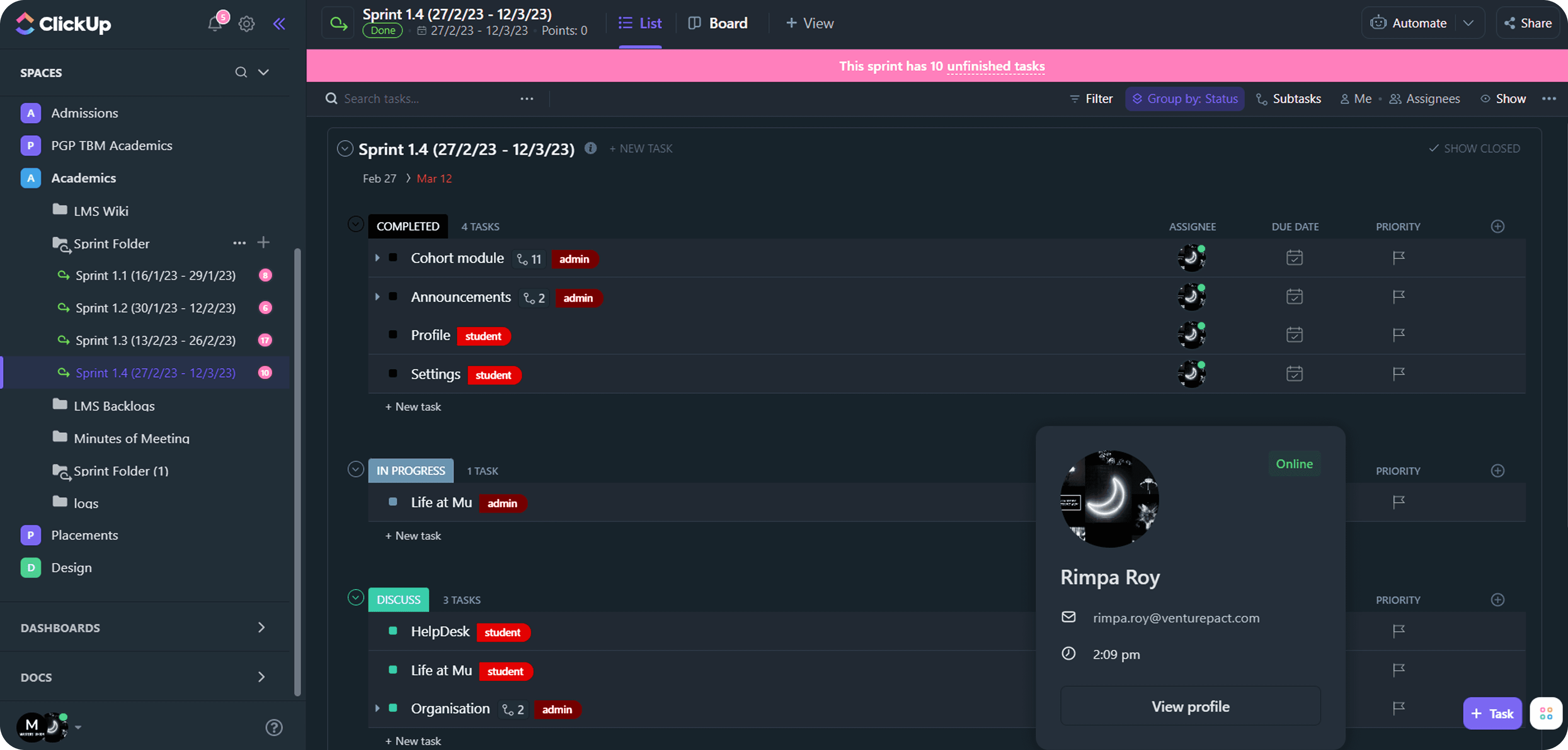
Sprint Management
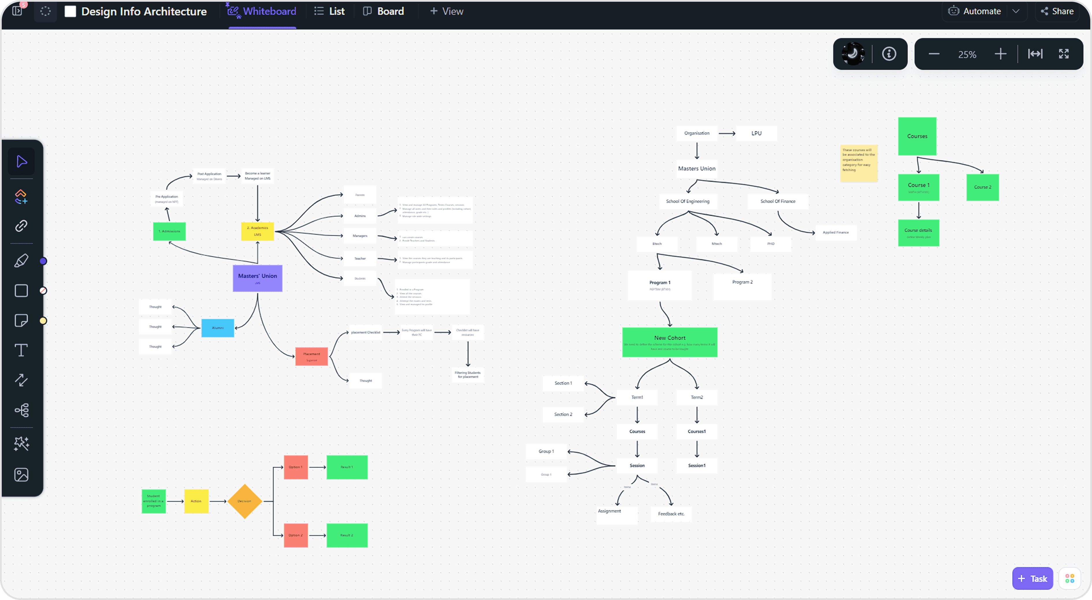
Information Architecture
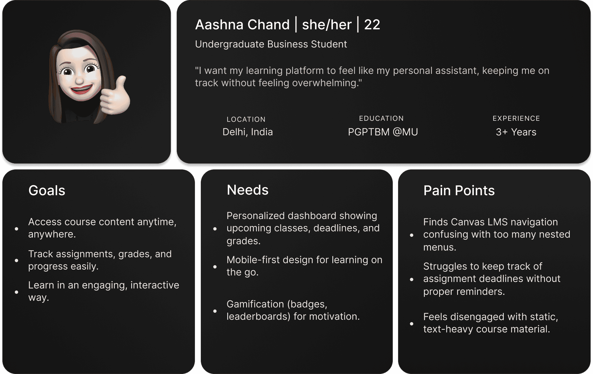
User Persona
I developed a user persona to identify the ideal user who would gain the most value from innovative collaboration design tools. This process allowed me to focus on the goals, needs, and frustrations of a core product designer, specifically one navigating user experience design and experimenting with Mixed Reality workflows.
User Journey
Design Systems & Component
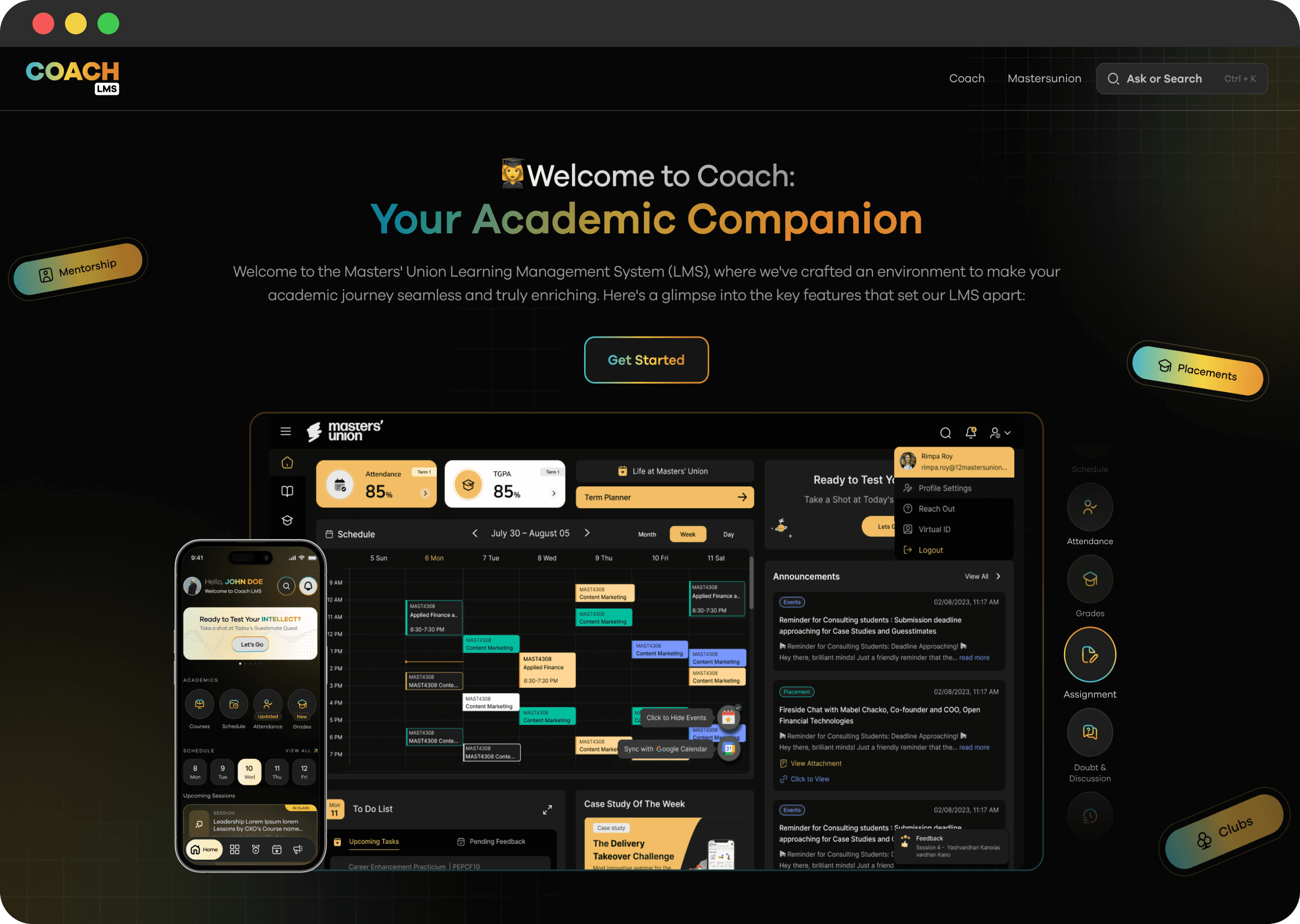
For Coach LMS, we built two distinct design systems for Students and Admins to support their very different mental models and workflows.
The student system was more engaging and dark theme-driven, while the admin system prioritized light theme with clarity, low cognitive load, and predictable patterns for handling complex, nested tasks. This dual-system approach improved consistency across the product and reduced design–dev iteration time by 40–50%.
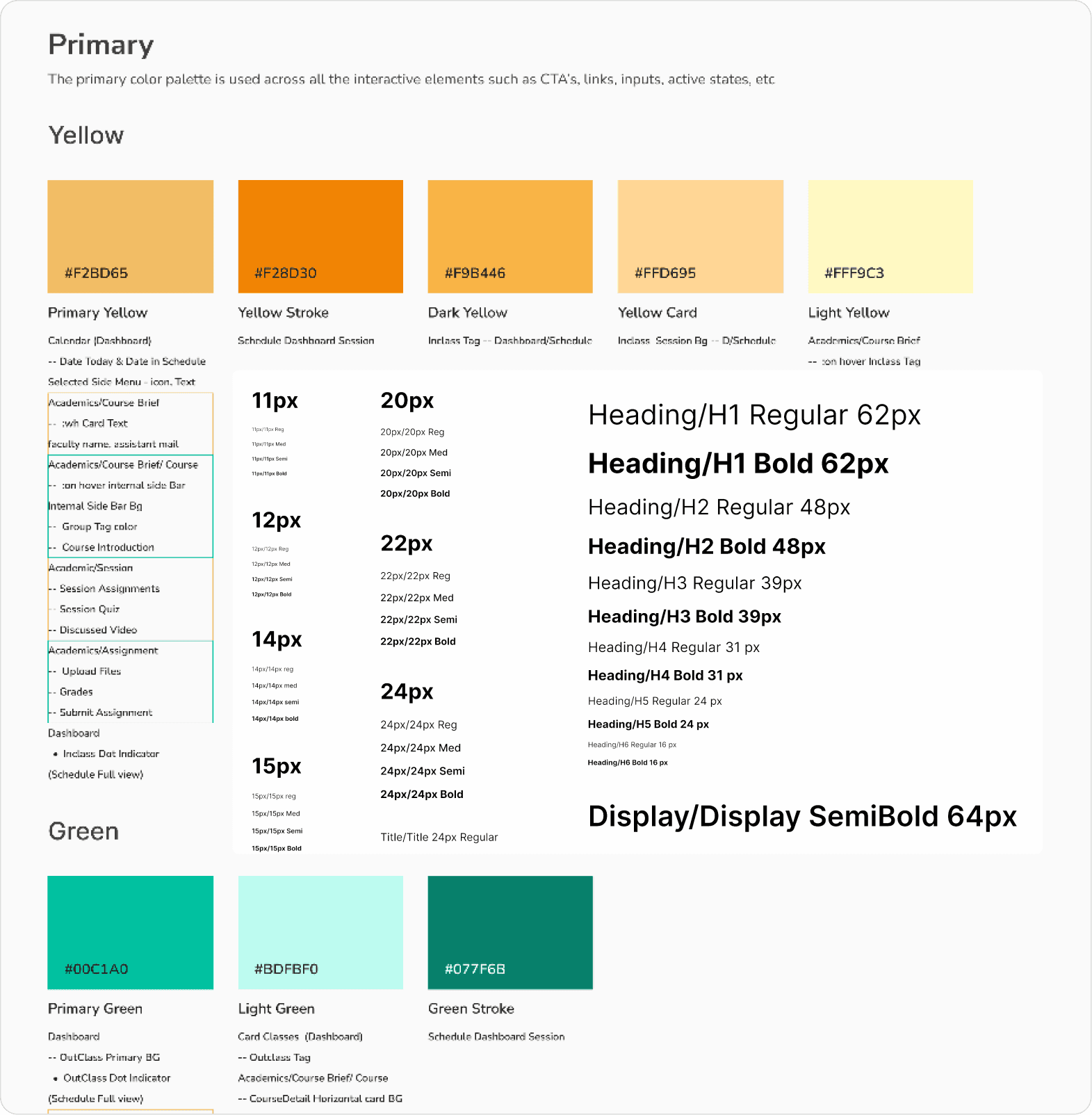
Ref. Image: Quick snap of Coach LMS's built design system
Design Approach
How do we achieve our goals?
Teachers need templates + drag & drop to reduce course-creation time ( → design priority: course builder).
Students need a mobile-first, glanceable dashboard and lightweight engagement hooks (badges, reminders).
Admins need real-time dashboards, exportable reports, and scheduling conflict detection to reduce manual ops work.
A cohesive design system is essential to scale rapidly while keeping UI consistent across modules.

Ref. image: Student interface workflow
Key UX decisions
1. Created separate dashboards for clarity
Different user groups (students, teachers, admins) had conflicting mental models and information needs. I separated their dashboards into role-specific views to reduce cognitive load, surface the right priorities, and increase daily task efficiency.

Ref. Image: Admin, Faculty & Student Dashboard
2. Designed progressive disclosure for teachers
Faculty workflows were naturally complex. Instead of overwhelming them with all controls upfront, I introduced progressive disclosure — revealing advanced options only when needed. This kept the interface approachable while supporting expert use.
3. Simplified course setup from 15 steps → 5
Initial course creation required multiple scattered actions. I restructured the flow into a guided sequence, consolidated redundant fields, and removed low-value steps—reducing setup time by 80% and improving completion rates.
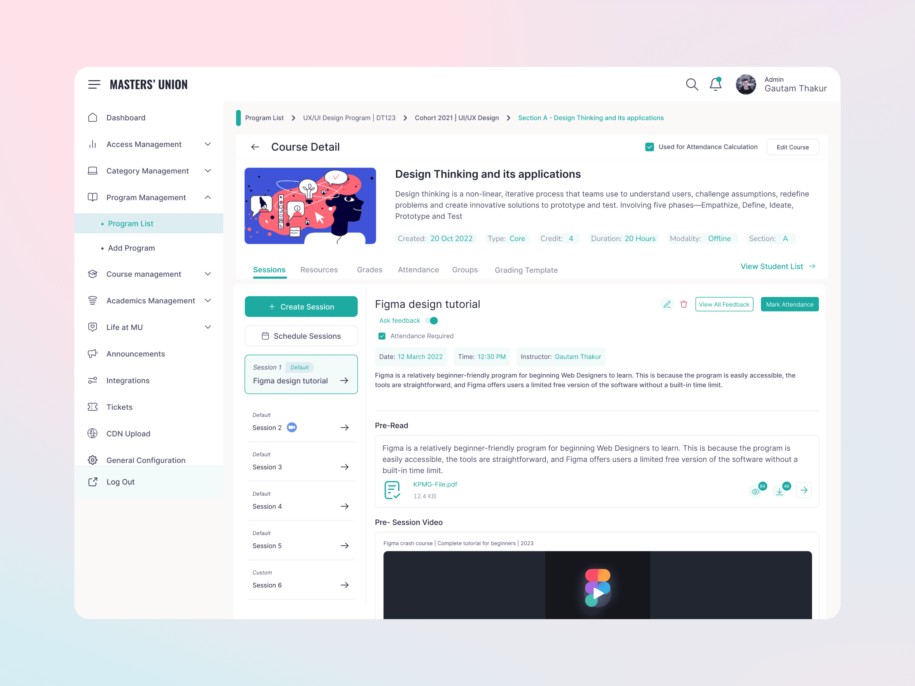
Ref. Image : Course Creation Flow_Admin/Faculty
Introduced real-time analytics tiles
Admins and faculty lacked visibility into activity trends. I designed lightweight analytics tiles to surface engagement, attendance, and performance insights instantly — enabling faster decision-making without navigating deeper reports.
Impact Metrics
2500+ active users on CoachLMS (students, teachers, admins), 1500+ active user across three different Institutions/ universities.
80% ↓ course creation time, 75% ↑ student engagement, 60% ↓ admin workload, 80% ↑ reporting accuracy — these are design outcome metrics from our post-launch analytics and stakeholder feedback.
Market Validation :
TAM: $25B global LMS market
SAM: $10–15B academic & cohort-based LMS segment
SOM: $50–200M near-term target (business schools + training institutes)
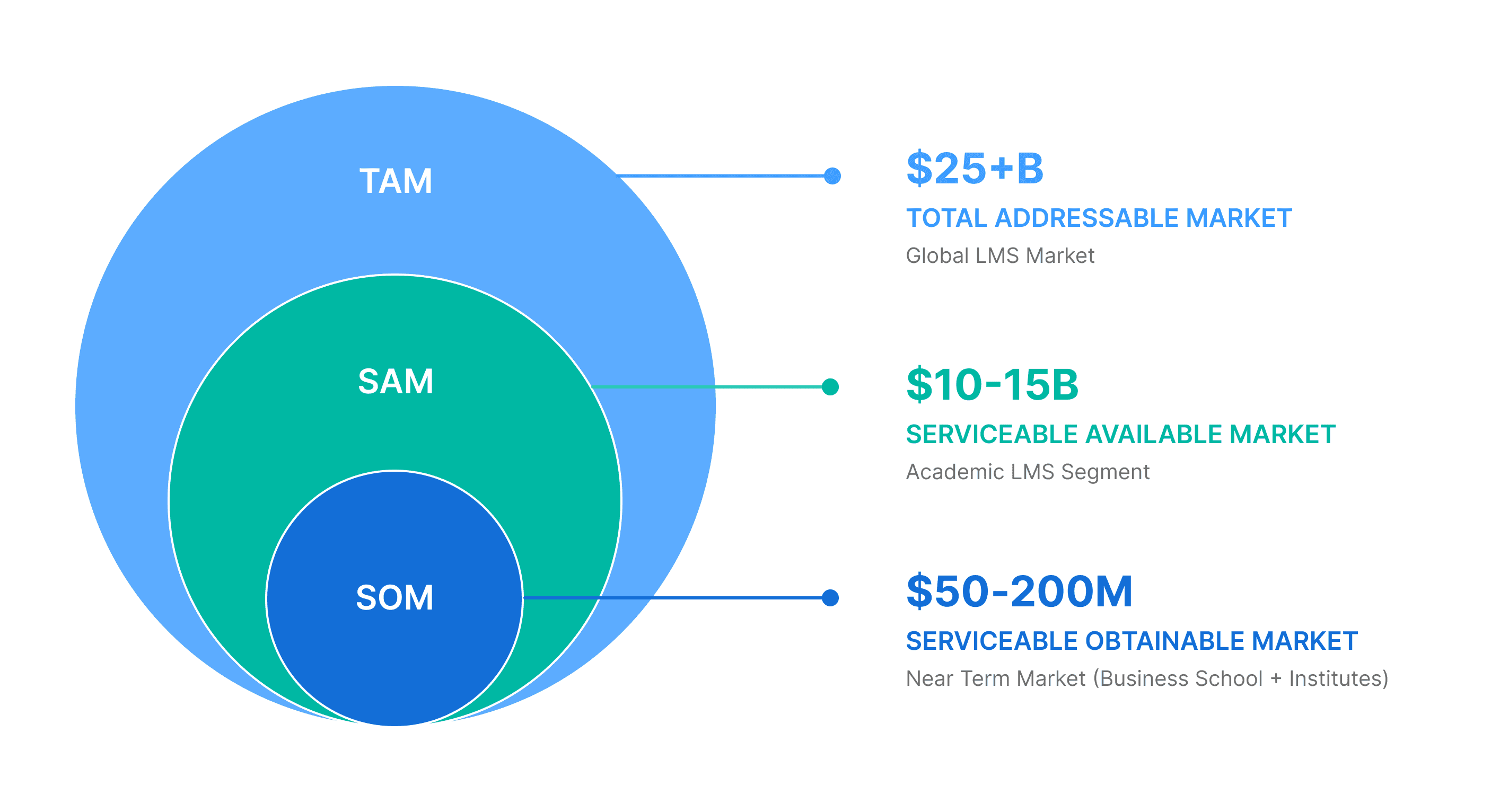
The $25B LMS market is growing 17–19% annually — and Coach LMS meets this demand with modern UX, real-time analytics, and proven results: +75% engagement, 80% faster course creation.
NDA Disclaimer
Due to NDA (Non-Disclosure Agreement) constraints, certain screens, features and internal product flows, are abstracted or omitted.
This case study focuses on the core UX decisions, strategy, reasoning, frameworks, and outcomes shared here reflect my role and contributions to the overall project.
Comparable NDA limitations apply across the other case studies included.
Next work
Explore more
works.
View all
View all